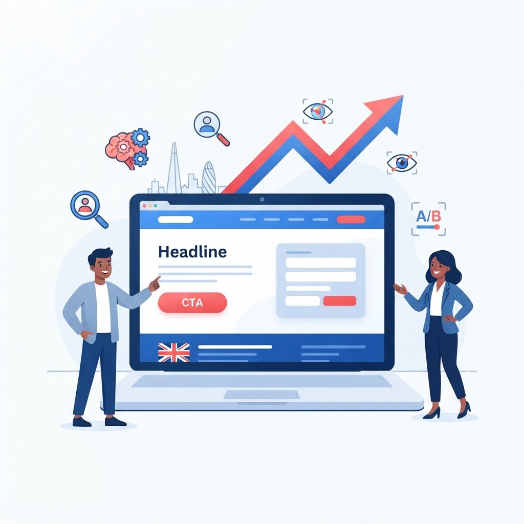
Most websites are leaving money on the table. Not because of poor traffic, weak offers, or bad copy — but because the user experience works against the very people it's meant to serve. UX psychology is the science of understanding how people think, feel, and make decisions online, and applying those insights to your website can dramatically increase the percentage of visitors who take action. At STEPS Solutions, we work with UK businesses — from independent traders in Halifax to growing brands across Yorkshire — to build websites that don't just look good but convert consistently. This guide explains exactly how to use UX psychology to double your website conversion rate, with practical, evidence-backed strategies you can start applying today.
What Is UX Psychology and Why Does It Matter for Conversions?
UX psychology is the application of cognitive and behavioural science to digital design. It explains why users click certain buttons, abandon certain pages, and trust certain brands over others. When you understand the mental shortcuts and emotional triggers that govern online behaviour, you can design experiences that guide visitors naturally towards conversion — whether that's a purchase, a form submission, a phone call, or a newsletter sign-up.
Conversion rate optimisation (CRO) backed by UX psychology isn't guesswork. It's a structured, repeatable process that produces measurable results. For UK businesses competing in crowded digital markets, it's increasingly the difference between a website that generates leads and one that simply exists.
"A well-designed user interface could raise your website's conversion rate by up to 200%, and a better UX design could yield conversion rates up to 400%." — Forrester Research
The Core Psychological Principles That Drive Website Conversions
Before you redesign a single page, you need to understand the foundational principles that influence how users behave online. These are not trends — they are documented cognitive patterns that apply across industries and audiences.
1. Cognitive Load Reduction
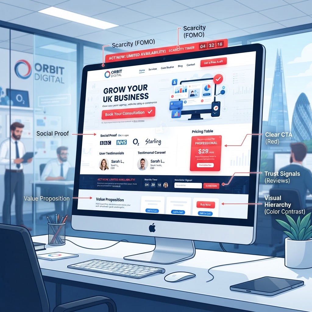
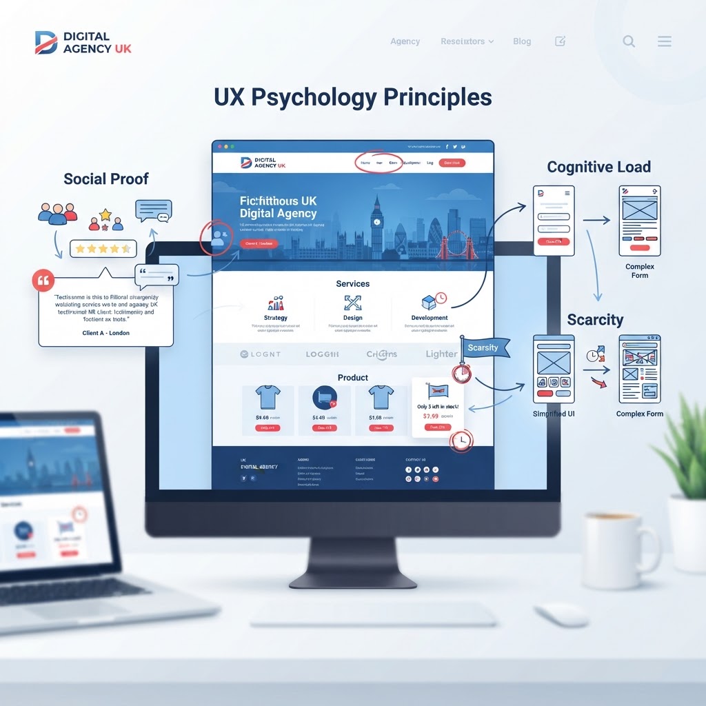
Cognitive load refers to the mental effort required to process information. When a website overwhelms users with too many choices, cluttered layouts, or confusing navigation, their brains take the path of least resistance — they leave. Reducing cognitive load means simplifying decisions, using clear visual hierarchy, and presenting one primary action per page. Every unnecessary element on your site is costing you conversions.
2. Social Proof and Trust Signals
Humans are deeply social creatures. We look to others for cues about what to do, especially in unfamiliar situations. Social proof — in the form of reviews, testimonials, case studies, star ratings, and client logos — directly reduces purchase anxiety and increases trust. This is especially important for Yorkshire-based businesses targeting local audiences, where community reputation carries enormous weight.
3. The Principle of Scarcity and Urgency
Scarcity taps into loss aversion — one of the most powerful motivators in human psychology. When something is limited in availability or time, people assign it more value and act faster. Used ethically and honestly, scarcity-based messaging (such as "Only 3 spaces left this month" or "Offer ends Friday") can significantly accelerate decision-making without resorting to manipulation.
4. The Paradox of Choice
Psychologist Barry Schwartz demonstrated that offering too many options leads to decision paralysis — users delay or avoid choosing altogether. Streamlining your offering, using pricing tables with a clearly recommended option, and reducing navigation complexity all apply this principle to improve conversions.
5. Reciprocity
Reciprocity is the human tendency to return favours. When a website offers genuine value upfront — a free guide, a useful tool, actionable advice — visitors feel a psychological pull to give something back, whether that's their email address, their attention, or their business. This is why content marketing and lead magnets remain highly effective conversion tools.
Practical UX Changes That Double Conversion Rates
Theory is only useful if it translates into action. Here are the highest-impact UX improvements you can make to a website right now, rooted in the psychological principles above.
Optimise Your Call-to-Action (CTA) Design and Placement
Your call-to-action is the fulcrum of every conversion. A weak or poorly placed CTA can make even excellent copy irrelevant. Effective CTAs:
- Use first-person language ("Get My Free Quote" outperforms "Get a Free Quote")
- Communicate clear, specific value rather than generic commands ("Start Saving Today" beats "Submit")
- Are visually distinct through contrast — not necessarily large, but unmistakably different from surrounding elements
- Are positioned above the fold on key landing pages and repeated at logical decision points throughout the page
- Reduce perceived risk with supporting micro-copy ("No credit card required", "Cancel anytime")
Build Trust Through Design Consistency and Credibility Signals
Users make trust judgements in milliseconds. A professional, consistent visual identity signals credibility before a single word is read. Credibility elements that directly improve conversions include:
- SSL certificates and visible security badges near checkout or form fields
- Real photographs of your team, premises, or clients (stock photos actively reduce trust)
- Clear contact information, including a physical address — particularly important for local businesses in Halifax and the wider Yorkshire region
- Verified third-party reviews from platforms such as Google, Trustpilot, or Checkatrade
- Industry accreditations, awards, or professional memberships displayed prominently
Use Heatmaps and Behavioural Analytics to Identify Friction Points
Friction is anything that slows a user's journey towards conversion. Common friction points include long forms, slow page load times, confusing navigation labels, and unclear value propositions. Tools such as Hotjar, Microsoft Clarity, or Google Analytics 4 reveal exactly where users drop off, what they ignore, and what draws their attention. At STEPS Solutions, we use behavioural data as a starting point for every CRO project — because assumption-led redesigns rarely outperform data-led ones.
Apply the F-Pattern and Z-Pattern Reading Behaviours
Eye-tracking research consistently shows that users scan web pages in predictable patterns. On text-heavy pages, they follow an F-pattern — reading across the top, then scanning down the left side. On pages with more visual content, a Z-pattern is more common. Placing your most important information and CTAs along these natural reading paths ensures they're seen, not skipped.
The Role of Page Speed and Mobile UX in Conversion Psychology
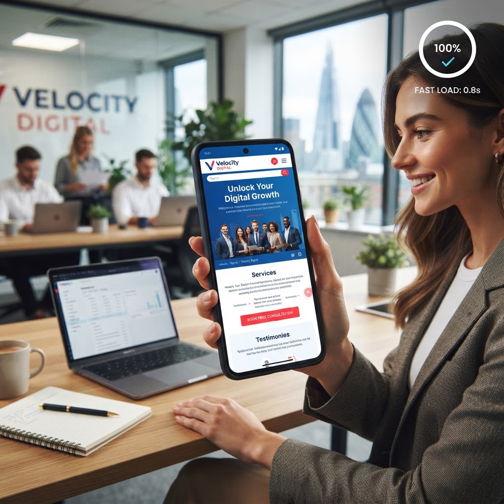
No amount of psychological optimisation will save a slow website. Page speed is directly tied to cognitive load — users interpret slow load times as a signal that something is wrong, and their trust evaporates accordingly. Google's data shows that as page load time increases from one to three seconds, the probability of a user bouncing increases by 32%.
For mobile users — who now account for the majority of web traffic in the UK — the stakes are even higher. A mobile UX that requires pinching, zooming, or hunting for buttons actively destroys conversions. Responsive design is no longer optional; it is the baseline expectation. STEPS Solutions builds every website with a mobile-first approach precisely because this is where the majority of conversion opportunities now exist.
A/B Testing: The Only Way to Know What Actually Works
A/B testing (also called split testing) is the practice of showing two versions of a page or element to different segments of your audience and measuring which performs better. It is the gold standard for conversion rate optimisation because it replaces opinion with evidence. Even small, well-structured tests — testing headline phrasing, CTA button colour, or form length — can reveal significant conversion lifts over time.
The most important rule of A/B testing: test one variable at a time. Testing multiple changes simultaneously makes it impossible to identify which change drove the result. Start with your highest-traffic pages and your primary conversion action, then work outward from there.
Key Takeaways
- UX psychology applies cognitive and behavioural science to website design, directly increasing conversion rates.
- Reducing cognitive load — simplifying choices and layouts — is one of the most impactful changes you can make.
- Social proof, trust signals, and credibility elements significantly reduce purchase anxiety and increase conversions.
- Optimising your call-to-action with specific language, clear value, and strategic placement can deliver immediate conversion gains.
- Page speed and mobile UX are psychological signals as much as technical ones — slow or broken experiences destroy trust instantly.
- A/B testing is the only reliable way to distinguish between what you think works and what actually does.
- Businesses in Halifax, Yorkshire, and across the UK can benefit from working with a specialist agency like STEPS Solutions to implement these strategies systematically.
Frequently Asked Questions
What is UX psychology and how does it improve website conversion rates?
UX psychology is the application of cognitive and behavioural science principles — such as social proof, cognitive load reduction, scarcity, and reciprocity — to website design. It improves conversion rates by aligning the user experience with how people naturally think and make decisions, reducing friction and guiding visitors towards taking a desired action, such as making a purchase or submitting an enquiry.
How long does it take to double a website's conversion rate?
The timeline depends on current traffic levels, the extent of changes made, and how rigorously A/B testing is conducted. Many businesses see meaningful conversion improvements within four to eight weeks of implementing UX psychology changes such as CTA optimisation, trust signal additions, and cognitive load reduction. Doubling a conversion rate through systematic CRO typically takes three to six months of continuous testing and refinement.
What are the most effective UX changes for improving conversion rates?
The most effective UX changes for improving conversion rates include: optimising call-to-action copy and placement, adding genuine social proof such as verified reviews and testimonials, improving page load speed, simplifying navigation and reducing choices, displaying clear trust signals near conversion points, and ensuring a fully responsive mobile experience. These changes address the most common psychological barriers to conversion.
Does page speed really affect conversion rates?
Yes, significantly. Research from Google shows that a page load time increase from one to three seconds raises the probability of a user bouncing by 32%. From a UX psychology perspective, slow load times signal unreliability and reduce user trust before any content is even seen. Improving page speed is therefore both a technical and a psychological conversion optimisation strategy.
Can a digital agency in Halifax help with UX and conversion rate optimisation?
Yes. STEPS Solutions is a digital agency based in Halifax, West Yorkshire, specialising in website development, SEO, and conversion rate optimisation for UK businesses. The team uses a data-led, UX psychology-informed approach to identify friction points, improve user experience, and systematically increase conversion rates for clients across Yorkshire and beyond.